
Mentorship App
Design
Case Study
Mentorship App
Design
Case Study
Please view it on a Laptop or a Tablet!
Sorry!
This
page is not
currently
compatible with
Mobile
dcjhjdncl
Mentorify
OVERVIEW
Mentorify is an app designed to connect mentees with mentors.
I aimed to solve issues in current mentorship platforms, such as information overload, long scrolling, and poorly organized elements by enhancing user experience.
In this project, more importance has been given to the visual design and interaction design.
ASPECTS
User Research, Interaction Design, Visual design, Prototyping
September 3, 2023 – December 3, 2023
Individual Project
dcjhjdncl
Research
Problems in Existing Apps
It takes too long to find proper information.
Text heavy page
Inconsistent icons and visual element
Does not have a proper information hierarchy
Long Scroll
It takes too long to find proper information.
Text heavy page
Inconsistent icons and visual element
Does not have a proper information hierarchy
Long Scroll
Text Heavy
Every section of the page is text-heavy
Disorganized elements
Important information is placed at the bottom, resulting in a lack of visual hierarchy.
Inspirations
1. MentorCruise
The platform efficiently displays mentor information.
It simplifies the process for users to find appropriate guidance.
The platform efficiently displays mentor information.
It simplifies the process for users to find appropriate guidance.
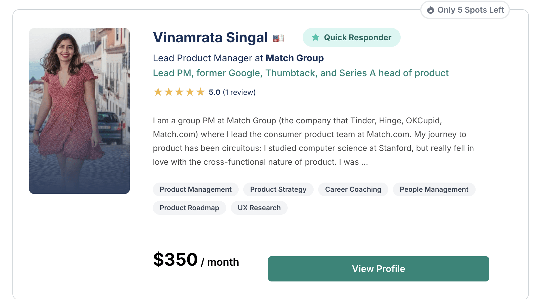
Clear representation of the information
Clear representation of the information
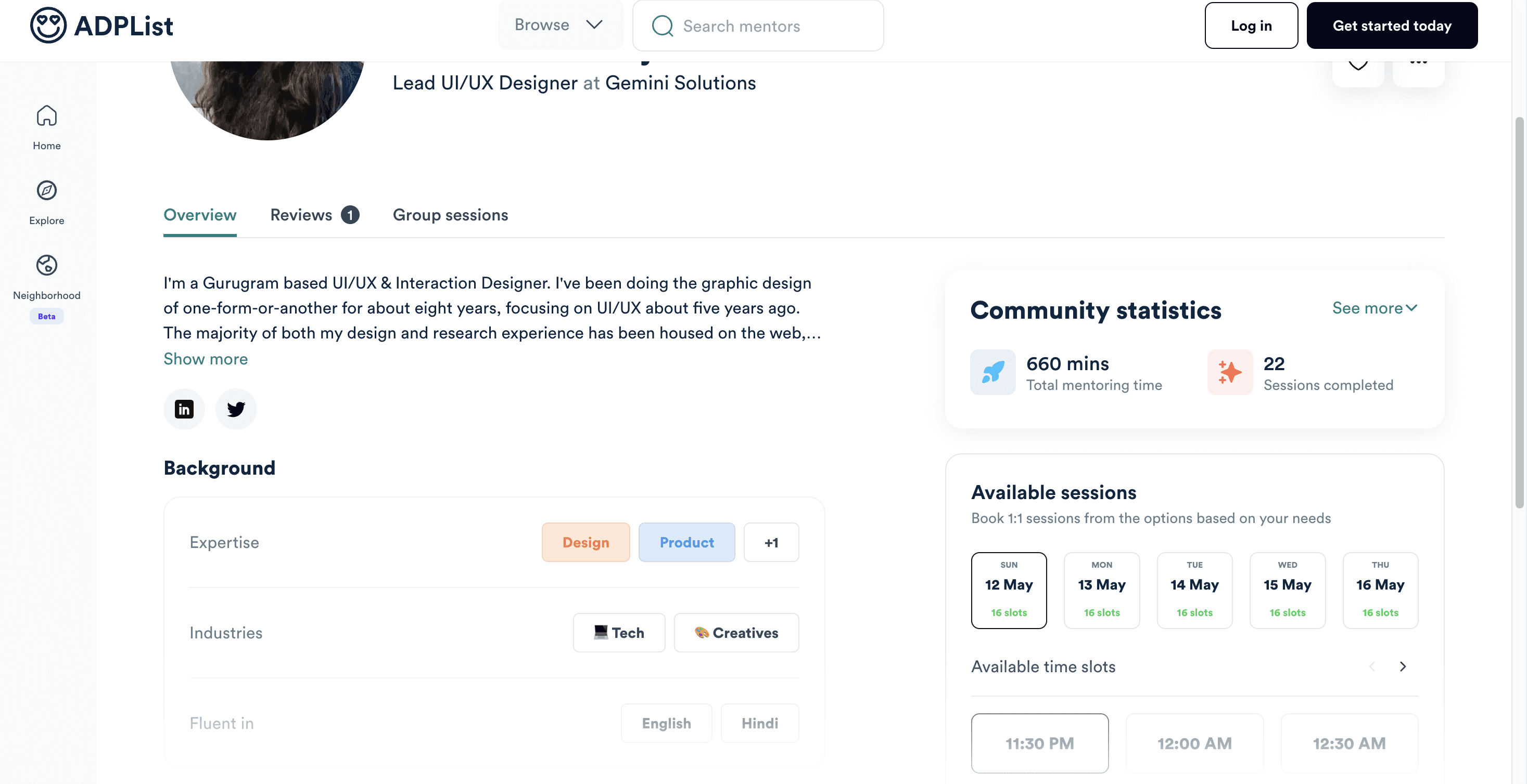
2. ADPList
The website features a well-designed and efficient mentor profile.
It utilizes minimalist designs and precise text for clarity.
The website features a well-designed and efficient mentor profile.
It utilizes minimalist designs and precise text for clarity.
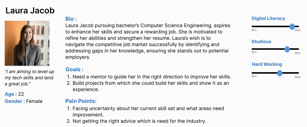
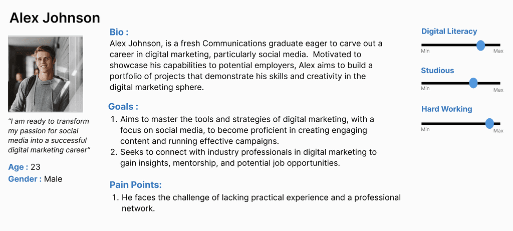
Personas
Analysis
1
Readable
Use information hierarchy to present relevant information clearly, rather than overwhelming users with excessive details.
2
Navigable
Include interactive features and organize elements in such a way that engages the users and is more interactive.
My goals for the project
User Stories
User Stories
“As a student, my days are mostly filled with classes in the morning and study sessions in the evening. I think the most important thing to achieve my educational and career goals is learning new skills and working hard!”
“I haven't had a formal mentorship experience yet, but I'm really interested in finding a mentor in the tech field. An app that matches me with mentors based on my interests and career aspirations would be incredibly helpful.”
Us
User Journey Map
Opens the mentorship app and logs in
Start
Browse through mentors
Adding mentors to the list
Give Request
Skips to next mentor
Opens the list
Removes the added mentor from the list
Gives request and gets a confirmation that the request has been sent
Engage in conversation with the mentor
No
Yes
Us
Wireframes
Paper Wireframe
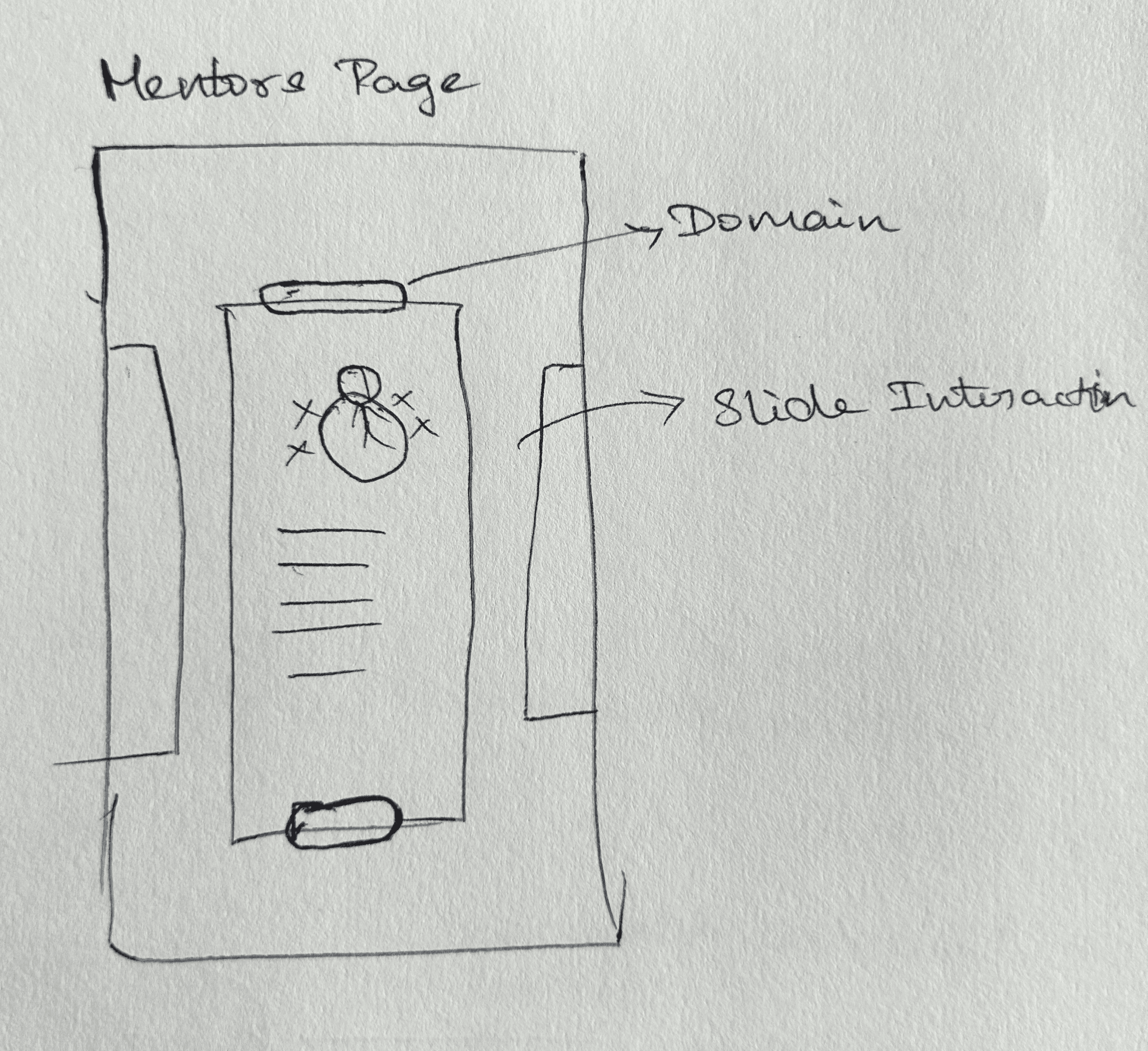

Mentor's Page
Saved List Page
It will have collections of mentors with their basic info.
Will have a list of saved mentors which students can select from later.
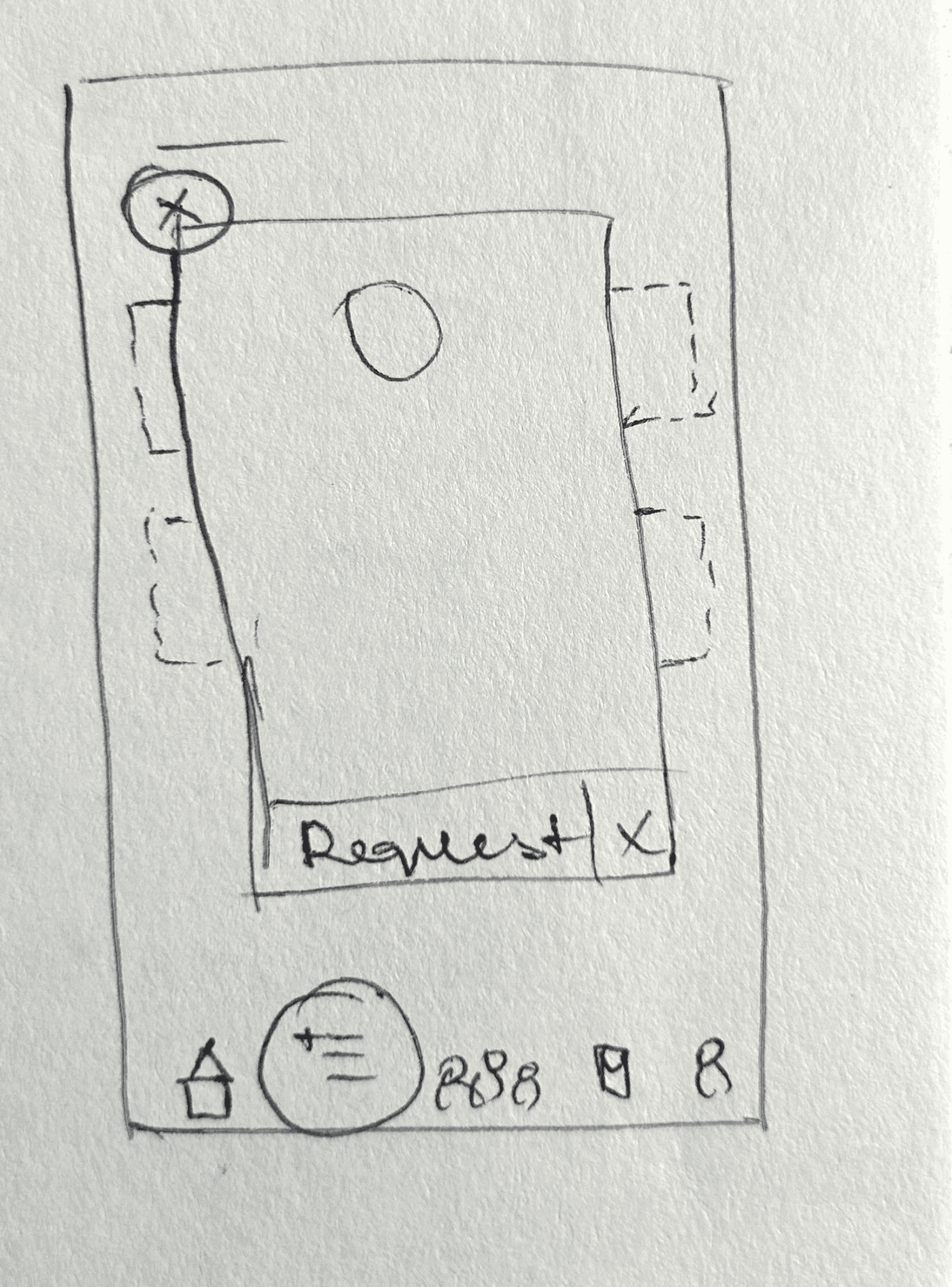
Saved List Page
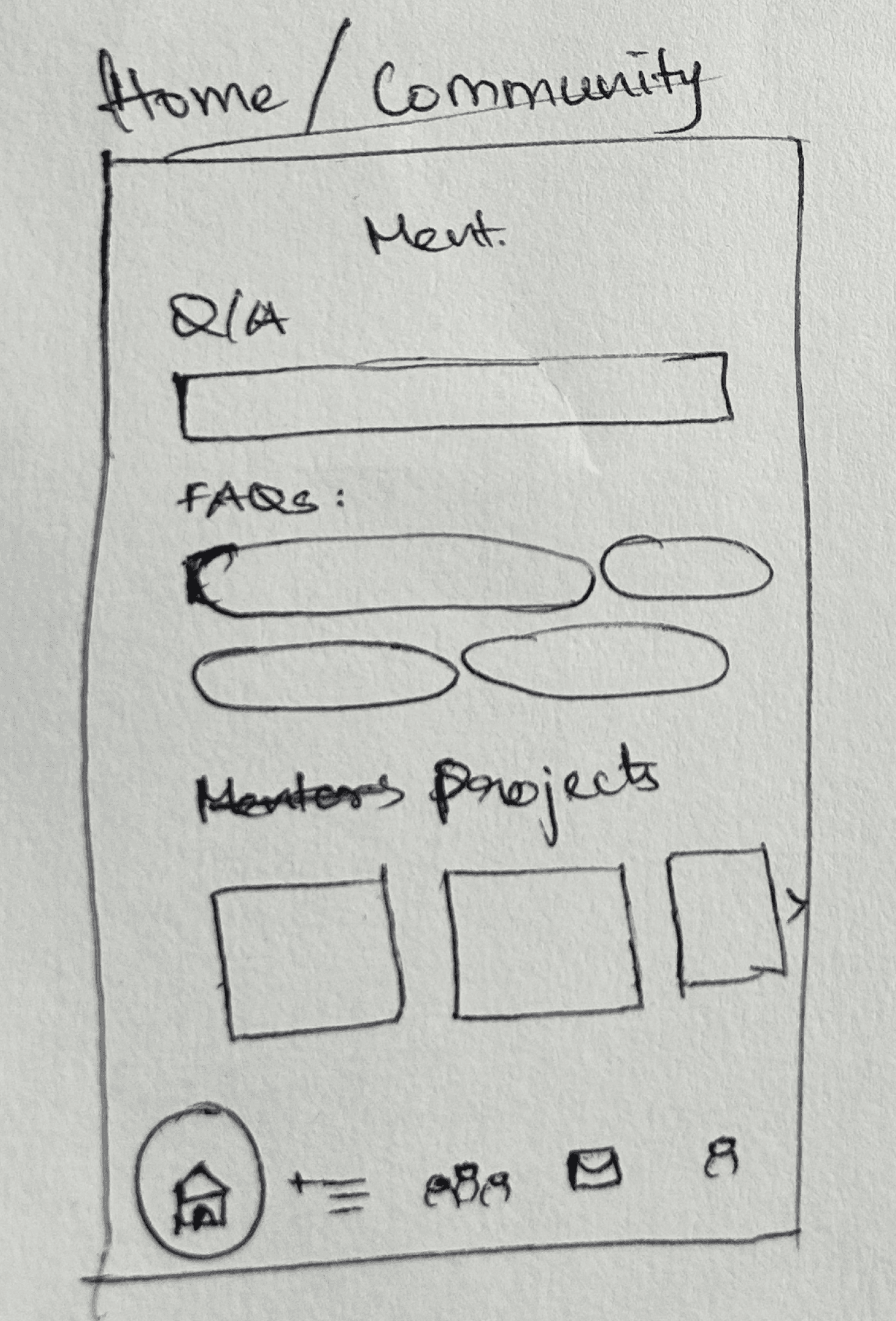
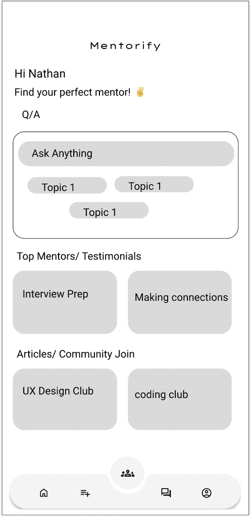
Home/Community Page
Viewing the information of a mentor from the saved list.
Will have top mentors, articles, groups, and workshop information.
Paper Wireframe


Mentor's Page
Saved List Page
It will have collections of mentors with their basic info.
Will have a list of saved mentors which students can select from later.


Saved List Page
Home/Community Page
Viewing the information of a mentor from the saved list.
Will have top mentors, articles, groups, and workshop information.
Messages Page
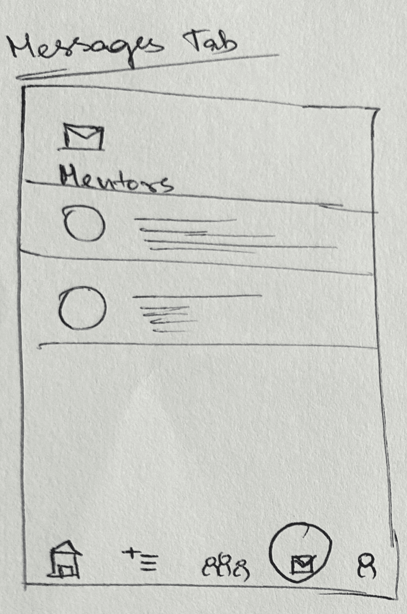
Will have messages from mentors.
Bottom Menu

Interactive Bubble menu
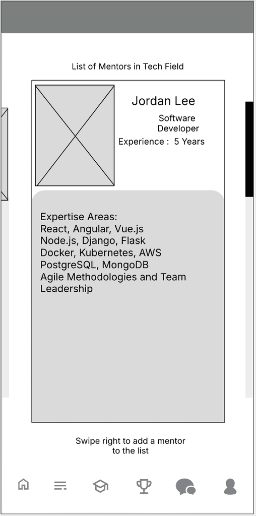
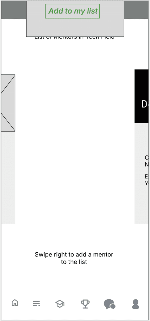
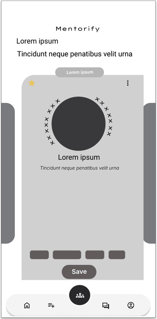
Digital Wireframes
Initial Wireframe
After several iterations




Design Decisions
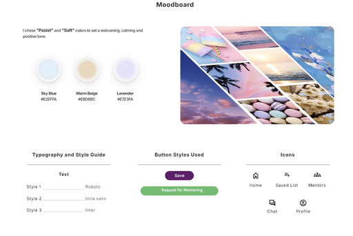

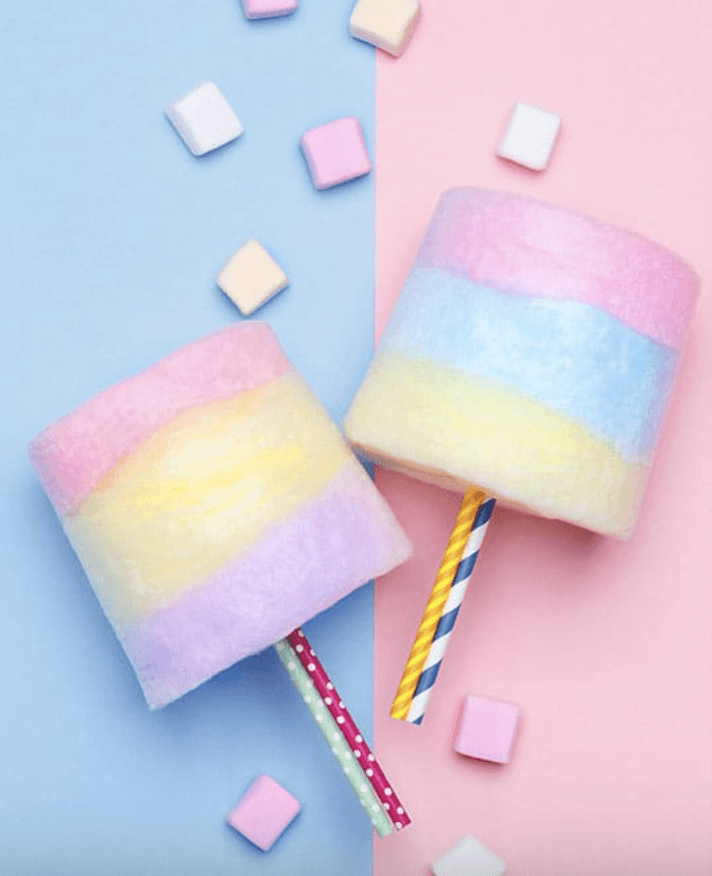
Moodboard
I chose "Pastel" and "Soft" colors to set a welcoming, calming and positive tone.
Sky Blue
#E2EFFA
Warm Beige
#EBD6BC
Lavender
#E7E3FA


Typography and Style Guide
Text
Style 1
Style 2
Style 3
Roboto
Inria sans
Inter
Button Styles Used
Save
Request for Mentoring
Icons
Home
Saved List
Mentors
Chat
Profile
Initial Mockup
Initial Mockup Design
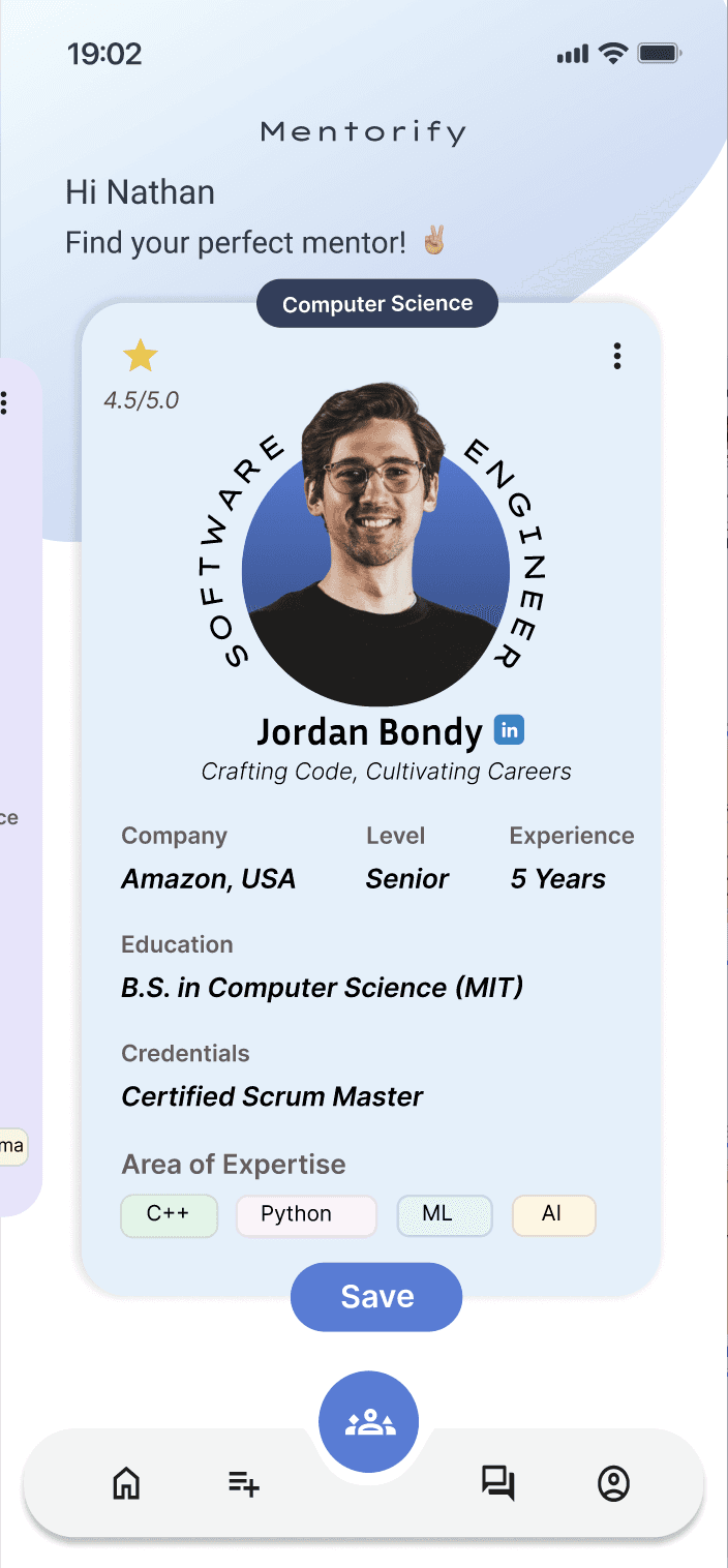
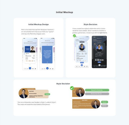
Here is the initial mockup that I designed. However, I am not satisfied with it because it feels too "typical" and may not effectively engage users.
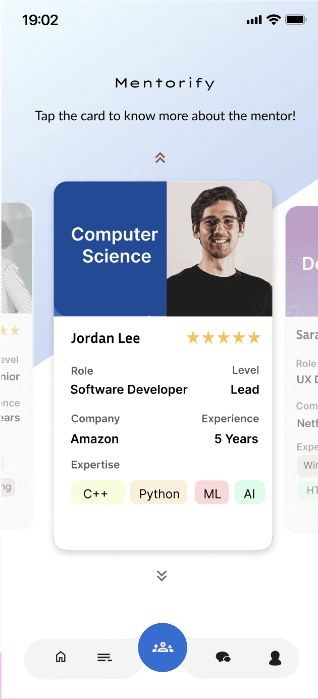
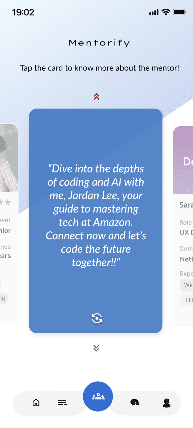
Style Decision
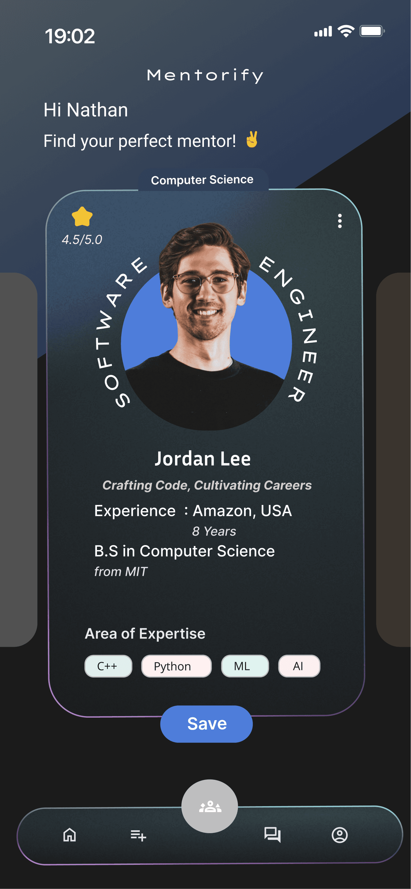
I have created two styles to determine which choice would be most suitable. Since I wanted to establish a positive, gentle tone, I chose to go with the light theme.

Style Decision

The micro-interaction was feasible in Style 2, unlike in Style 1.
The swipe will reveal the short details of the person.



Designs
Card Swipe Interaction.
This is where users can browse and find mentors.
Adding Mentor Interaction.
A mentor can be added to the list after browsing.
Micro Interaction.
Swipe -> Reveals the short information about the mentor.
Request Interaction.
Once the request is given to the mentor, Request Confirmation occus.
